
How important are fonts and layouts? They influence you without even making you realise it. They can directly manipulate your interest level in something. They can make a serious article seem childish and invitations to a bachelor party seem formal. In fact, as you’re reading this, your attention level is being controlled. What are we talking about? Why, fonts of course!
The right amount of spacing and the right font, used as per the content can go a long way in influencing your decisions. Especially in the design aspect of websites, the layout of the article with respect to the advertisements or other article suggestions is very important.
Take for example, the Medium website. The site showcases a very simple template design and a very minimal interface that is pleasing to the eye. The font is clear and the headlines are marked in bold, which instantly lends a soothing and clear feel to using the website. Also, the Uber website is another notable instance. Compare the layouts with the layout of Arngren, and you’ll instantly know what I’m talking about.
Now moving to fonts, we first need to understand what the major font styles are.
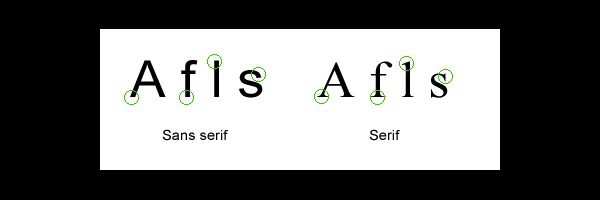
- Serif Fonts – Letters with short lines coming off the edges. Viewed as more formal and traditional. Best suited for print.
- Sans-serif Fonts – Letters without serifs. Viewed as informal and playful. Best suited for digital.
- Script Fonts – Resembles handwriting and often used in formal invitations. Not ideal for body copy.
- Decorative Fonts – Informal fonts viewed as original. Best suited for headlines but not body copy. Decorative typefaces should be used for content that is meant to be seen at a glance, like in a logo, rather than read as multiple paragraphs in body text.
When choosing the right font for body text, it’s usually best to stick with a Serif font or Sans-serif font.
So depending upon the type of content being written, one can choose a font accordingly. For instance, generally for research papers, Times New Roman is preferred as it lends a more professional feel to the article.
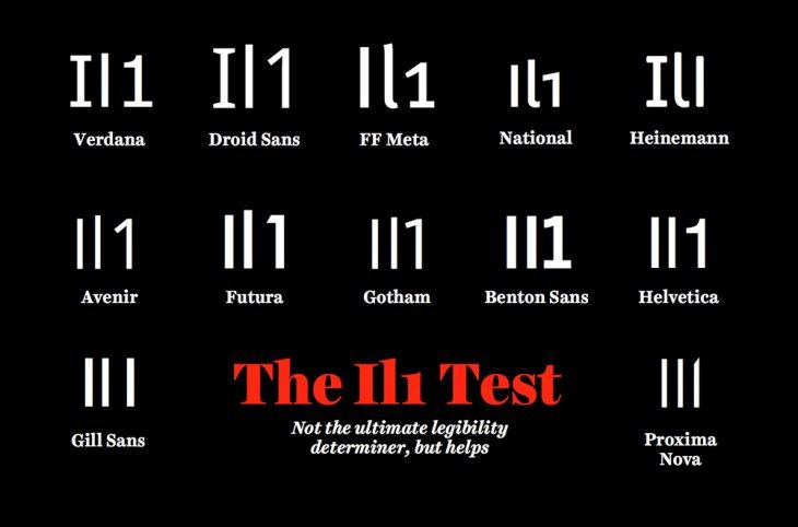
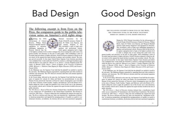
Besides the font styles, another important thing to keep in mind is legibility. Pick a font where one can clearly distinguish between similar characters – mainly ‘I’, ‘l (the lower case of L)’ and the number 1. The image below clears it out.
Generally, a narrow font (like Impact) is not favourable when you want to captivate your audience with text primarily. However, it is the best font when it accompanies an image, most notably in the case of Internet Memes.
A favourable approach would be to use a clear font that has well space out lettering. Also, in case of hard copies, the right font size should preferably be kept above 14 pts.
So how do fonts influence our interest?
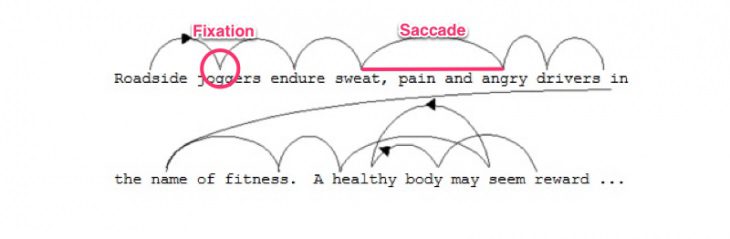
Here’s a useful article of the scan path that our eyes follow when we read something. When one reads something, they don’t generally process it mentally till they take a pause (which is why commas are also important in sentences!)

Also, some fonts are very significant culturally, so they are instantly recognisable. For example, the Courier font has a typeface resembling that of a typewriter, so it may be used accordingly for giving a ‘confidential’ or ‘conspiratorial (!)’ feel to the article. It is also widely popular as the typical font used in programming.

Comic-sans, one of the most widely criticised fonts, has been somewhat popular as a font used in comics till lately, when it was modified.
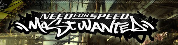
Games like Need for Speed – Most Wanted focus more on a rebel, racing environment. Hence they go with a font which has been popularised by vandals who spray-paint graffiti, most suitable for the theme of the game.
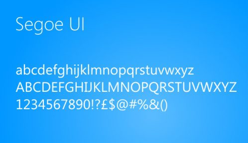
A couple of years back when Windows 8 was first launched, it has come with a minimal design. Keeping in tune with the revamped layout, Microsoft also changed the font to a simple Segoe UI, which is simple and pleasant to look at.
Photographers, for their watermarks, may either go for a formal font that is well spaced and clear, eg. Garamond, or might go for a Script / Decorative font which resembles a signature of the photographer, eg. Jellyka Saint-Andrew’s Queen.
Here’s a high res image of the top 100 fonts till date.
Conclusion
All in all, the correct combination of fonts is very important in making your articles interesting. The font used goes a long way in establishing the mentality of the reader towards your article.
However, that being said, the content is equally important!
Therefore, design and content go hand-in-hand in making your content stand out.