
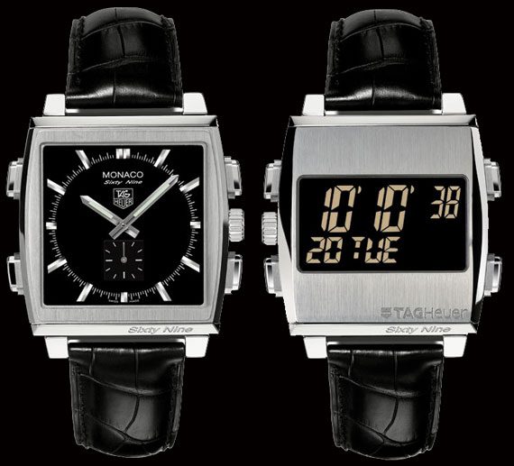
Watch the Time. Watch the watch in the watch ads, and watch the watches in the watch racks. Watch the clocks. What’s the time on each one? It’s 10:10.
If that had you befuddled, don’t be, what I’m about to discuss here is something we’ve all seen. Some of us have noticed- but never really bothered investigating it, while some others have always been intrigued.
Why does every Clock & Watch Advertisement have its time set to 10:10?
The Theories
There are a number of different theories that attempt to explain this phenomenon.
- Is it in the memory of the assassinations of Abraham Lincoln, John F Kennedy and Martin Luther King Jr, who ‘supposedly’ died ‘at that time’?
- Or is it because of the Hiroshima and Nagasaki bombings, which also ‘supposedly’ also occurred ‘at that same time’?
- On the other hand, could it be a result of a believed to be ‘auspicious time’?
No.
Lincoln, JFK and MLK Jr were ‘supposedly’ killed at that time only by conspiracy theorists. They were shot at different timings in reality, 10:15pm (pronounced dead at 7:22am), 12.30pm and 6:01pm (pronounced dead at 7:05pm), respectively.
In case of the atomic bombings, the Fat Man bomb was dropped at 11:02am and the Little Man bomb at 8:15am. Now that myths have been busted, what is the mystery of 10:10?
Aesthetics, my dear
This may come as disappointment to the ‘conspiracy theorists’ and ‘myth builders’, since the reason is rather lucid and straightforward. It’s Aesthetics.
What’s so aesthetically appealing about watch time being set to 10:10?
- The hands of the watch ‘frames’ the logo of the brand, in a sense, which are generally placed under the ‘12’. Also the fact that this is symmetrical arrangement, makes it more pleasing to see than an asymmetrical one.
- But there are other symmetrical positions, that the hands can assume, whilst not covering the logo, like 8:20. So why not use that?
10:10 time on a watch is a smile
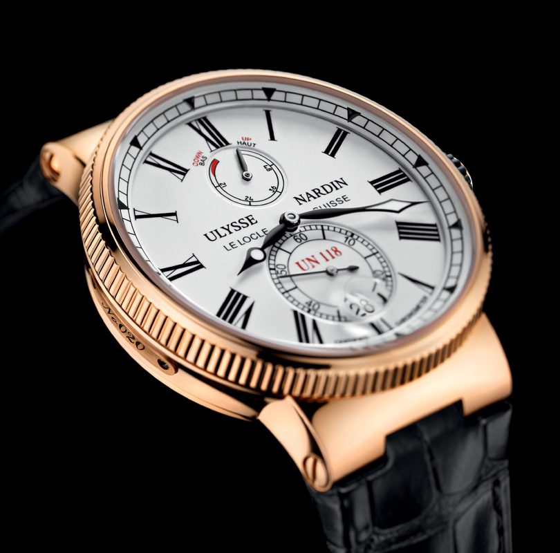
The 10:10 gives a subtle impression of a smile, whereas the 8:20 formation gives the impression of a frown. The 10:10 arrangement makes the watch look ‘happier’, and is almost like an unsaid norm. But, Ulysse Nardin in a recent ad in New York Times, went against this norm, and was unlike 22 of the 24 ads of watch brands. They set their watch at 8:19, and the other exception was the ad of an Oris wristwatch, whose watch was set at 8:03.
Of course, you could point out that even 2:50 would give us a smile just like 10:10. IT’s just that hands are interchanged. So why haven’t watch companies picked 2:50 instead? I’m stumped there – although the only theory I have would be the positions of the hours and minutes hands – having the hours hand on the left does look better. Or maybe that’s just me.